Warren Buffett style fundamental metrics of long-term company performance
Marton Trencseni - Mon 02 December 2019 - Investing
Introduction
Over the years I’ve read a lot of books on investing, especially Warren Buffet-style value investing. I also read Warren Buffet’s yearly investor report. Some relevant links:
- Benjamin Graham - The Intelligent Investor
- Berkshire Hathaway Letters to Shareholders
- Graham, Dodd - Security Analysis
- Mary Buffett (ex-wife of WB’s son) - The Warren Buffett Stock Portfolio
- Stockpup
- Warren Buffett : Latest Portfolio
Recently I found some great online resources which give this style of analysis (called fundamental analysis) of companies, and I ended up spending hours browsing company metrics. So here I will show (from these sources) fundamental metrics of publicly traded companies. The point of the exercise is to get a feeling for what these metrics look like for companies in different industries, at different stages of their lifecycle. Most of the charts shown here are from Stockpup.
Apple (AAPL)
Let’s start with Apple because Warren Buffett holds AAPL stock himself.
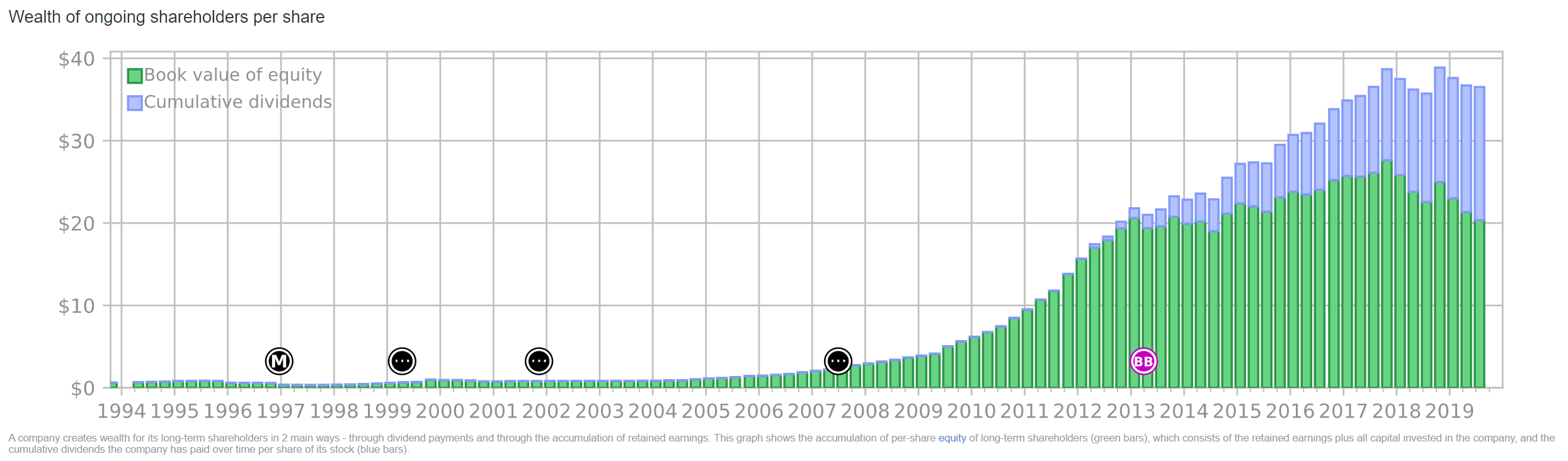
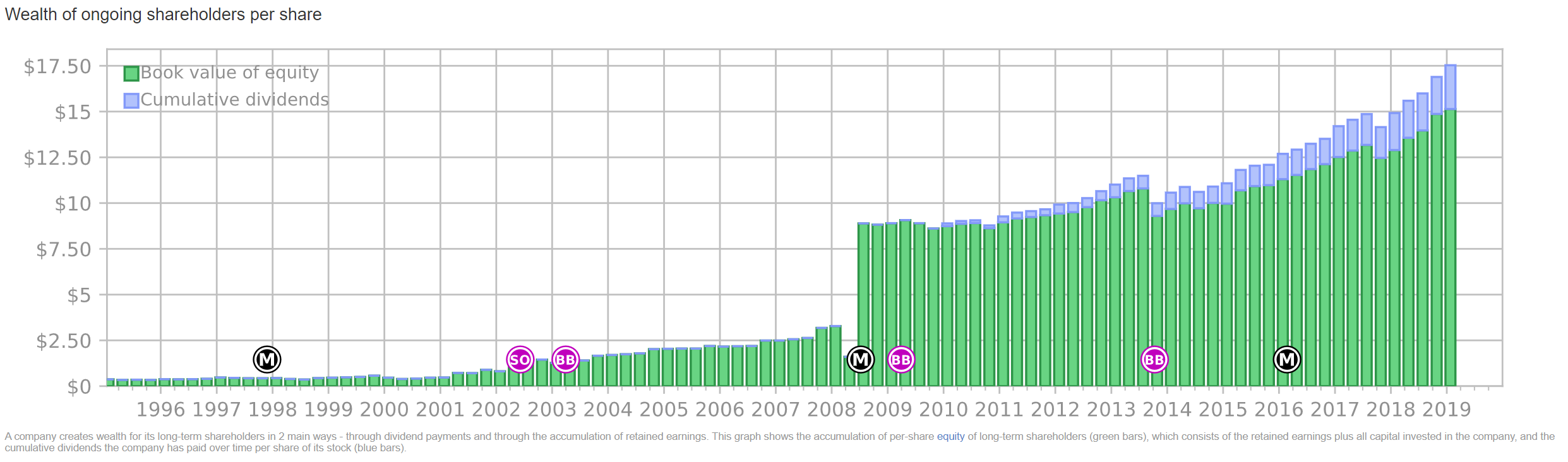
Cumulative shareholder wealth. This is an interesting chart: it shows, per quarter, the book value of the company at the point in time (green), and the cumulative dividends that the company paid out to shareholders up to that point in time (blue). The reason this chart is structured like this is, it says, if you bought 1 piece of AAPL stock in 1994, this is how much “sure money” that 1 stock is worth today. The cumulative dividends are “sure money”, since it’s cash that Apple has given you over the years. And book value is the closest accounting equivalent: it’s total assets minus total liabilities. The total assets can include intangibles like “brand value”, if it was a result of a purchase. One way to think of book value is, this is how much would be left if the company would sold off what it has (including intangibles, with a reasonable assumption of marketability) and paid back liabilities. Note that this chart has nothing to do with the share price of the stock we have to pay on the open market, in 1994 or at a later time. Notice how Apple started paying dividends in 2012.
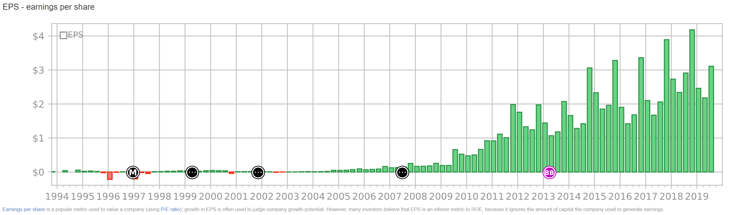
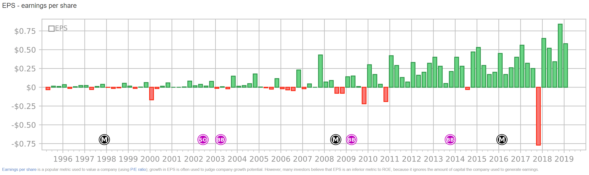
Earnings per share. This shows the amount of profit the company made per quarter. Clearly Apple’s earnings have exploded over the last 20 years, and show a nice cyclical pattern (Q4 = christmas). Note that, when a company earns profit, it can re-invest it, keep the money as cash or mostly liquid investment, or pay it out as dividends. In both the latter two cases it would show up as a positive contribution on the cumulative shareholder wealth chart.
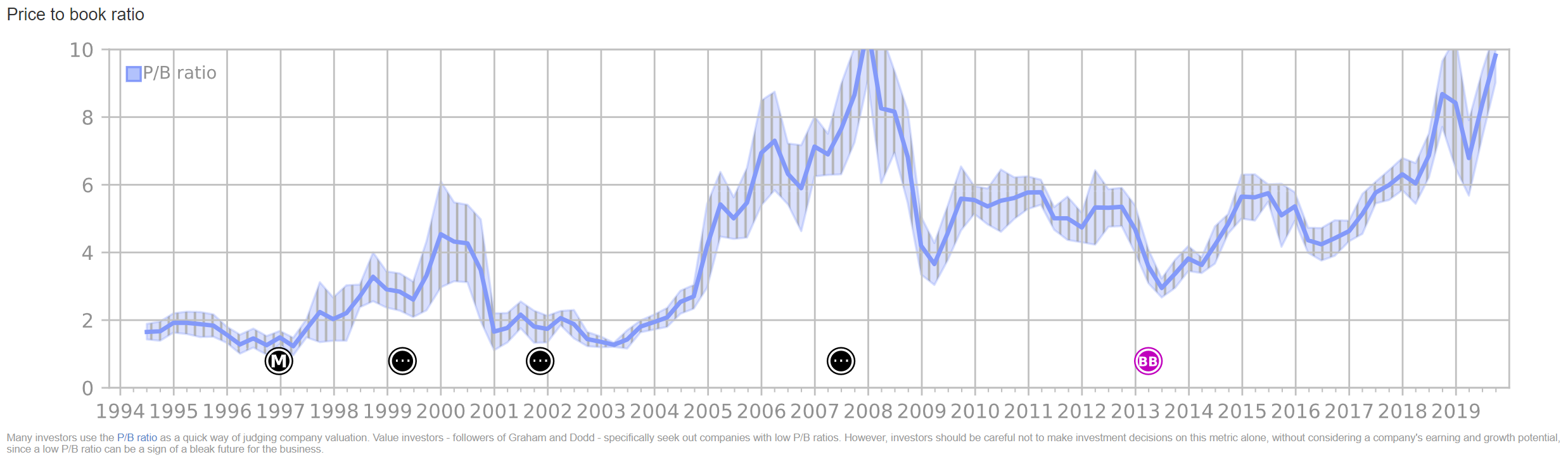
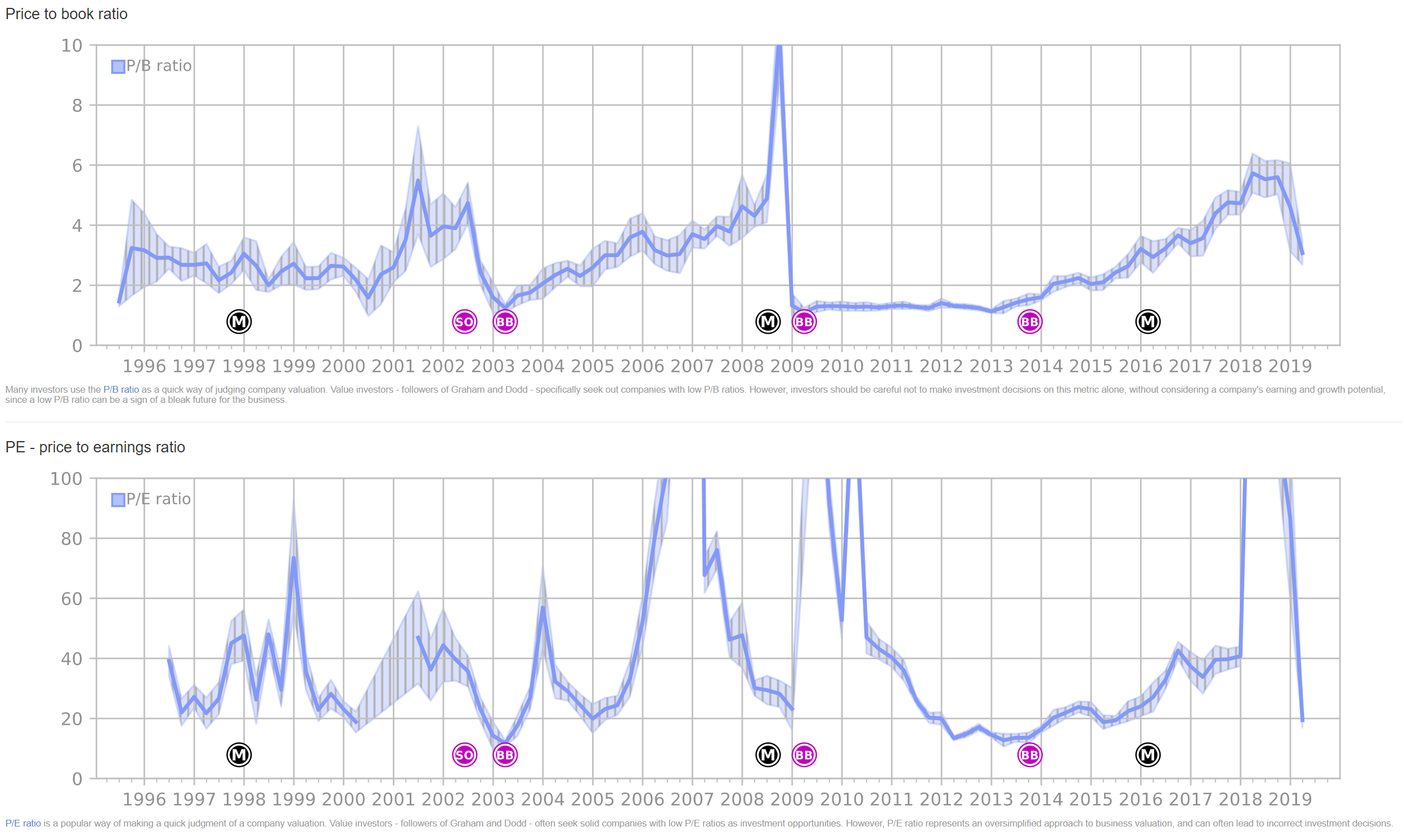
Price to book ratio. This is the chart that incorporates the market price of the stock. It’s the ratio of the market price of AAPL (as traded on NASDAQ) and the book value, as shown on the first chart. The P/B ratio picks up in 2005-2006 (iPods, new Macbook Pros), peak around 2008 (after iPhone release).
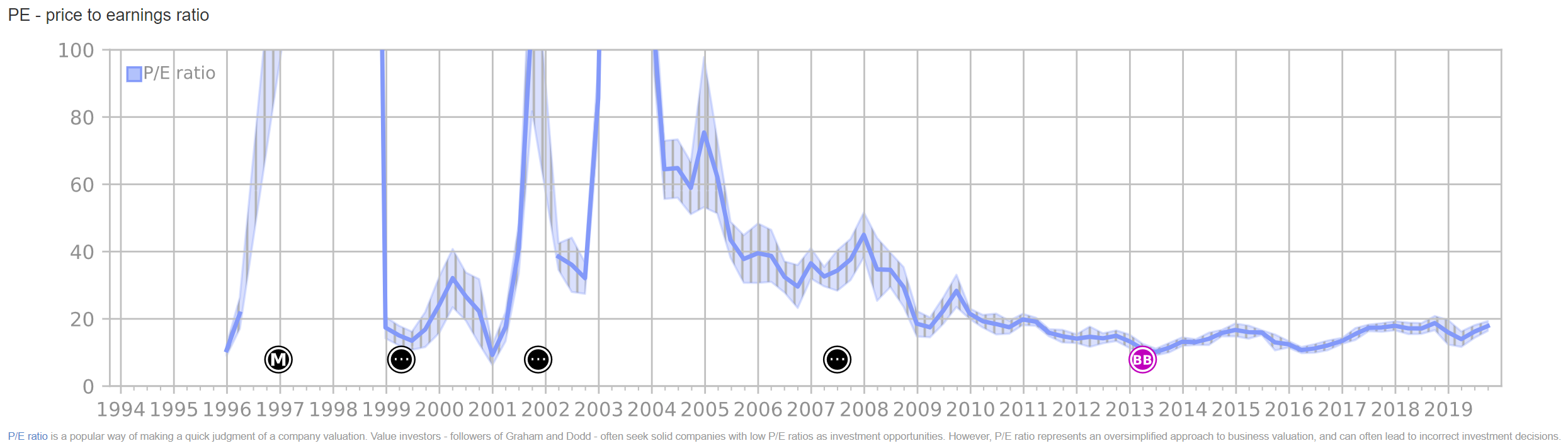
Price to earnings ratio. It’s fun to see how before 2005 or so, when earnings were low, this ratio is literally off-the-charts.
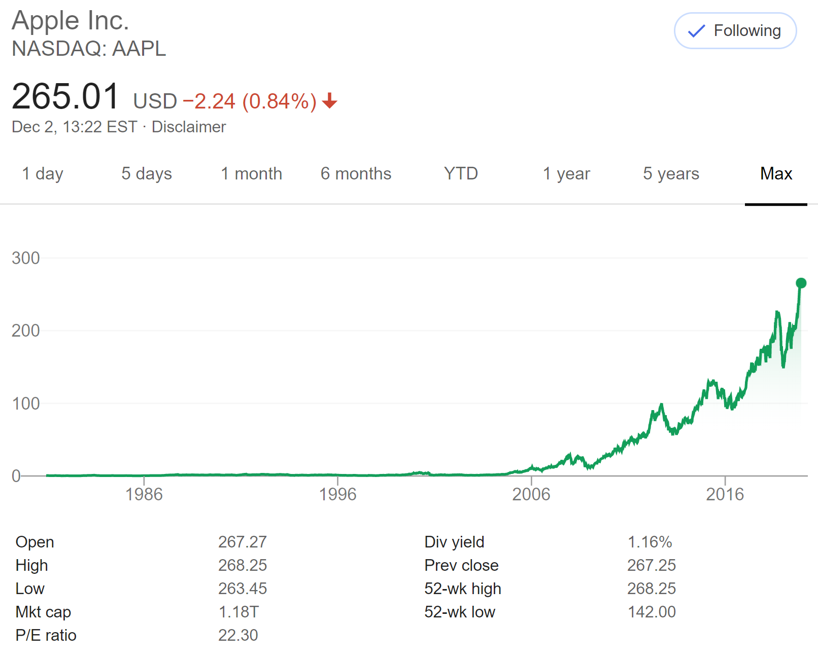
Stock performance. And finally, the long-term stock performance chart:
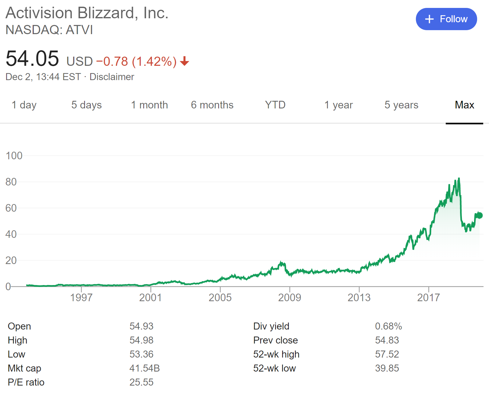
Activision Blizzard (ATVI)
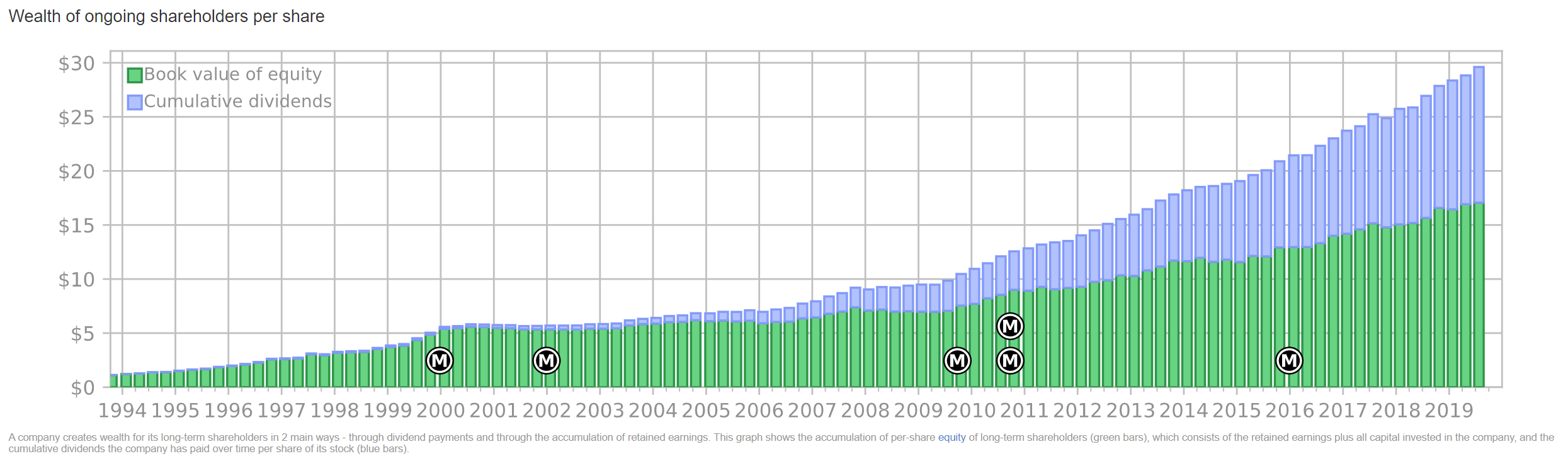
What does one of the biggest gaming companies, with franchises such as Starcraft, World of Warcraft, Diablo, Overwatch, Call of Duty and Candy Crush look like? Book value has gone up steadily; the big jump in 2008 is when Activision and Blizzard merged.
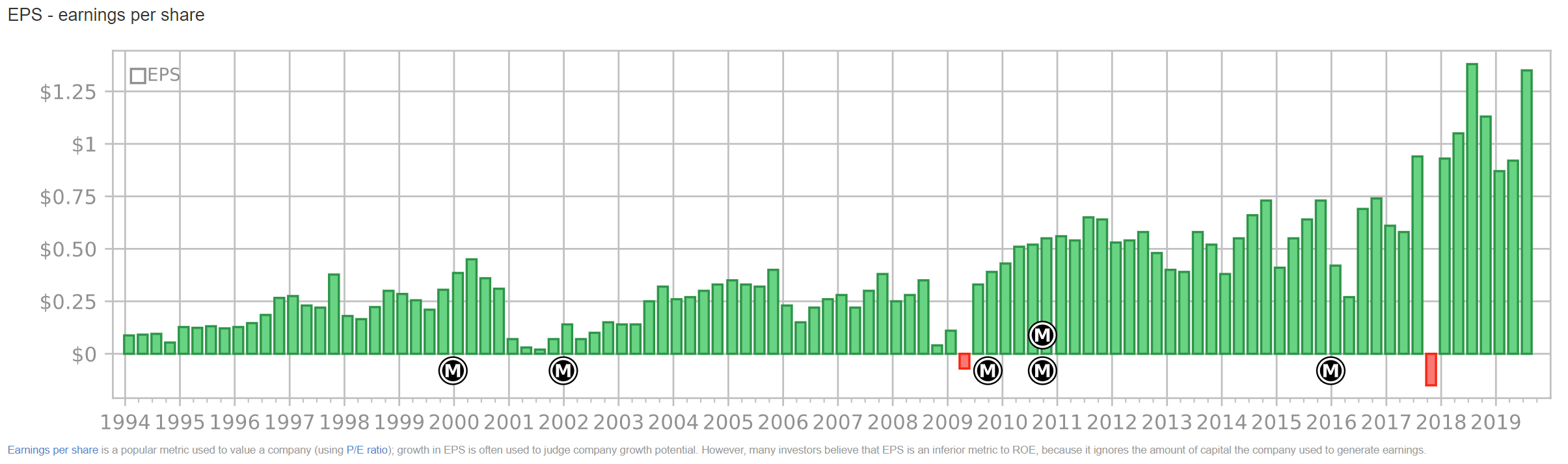
Earnings per share in increasing (the big 2017Q4 loss was a one-time tax hit):
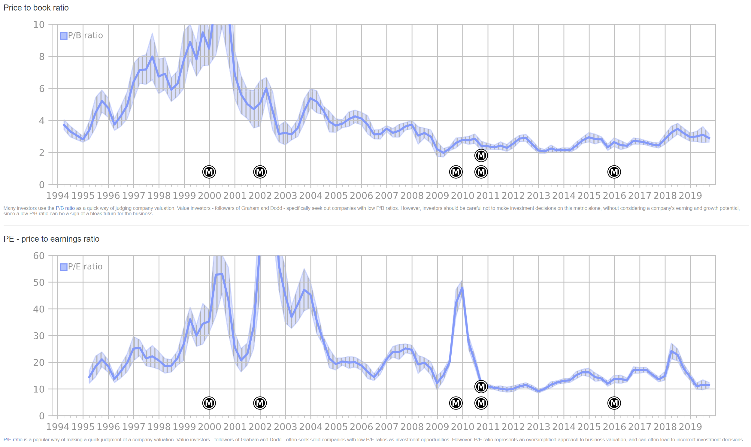
P/B ratio is quite low, P/E ratio is erratic because earnings vary quarter-to-quarter, but generally high:
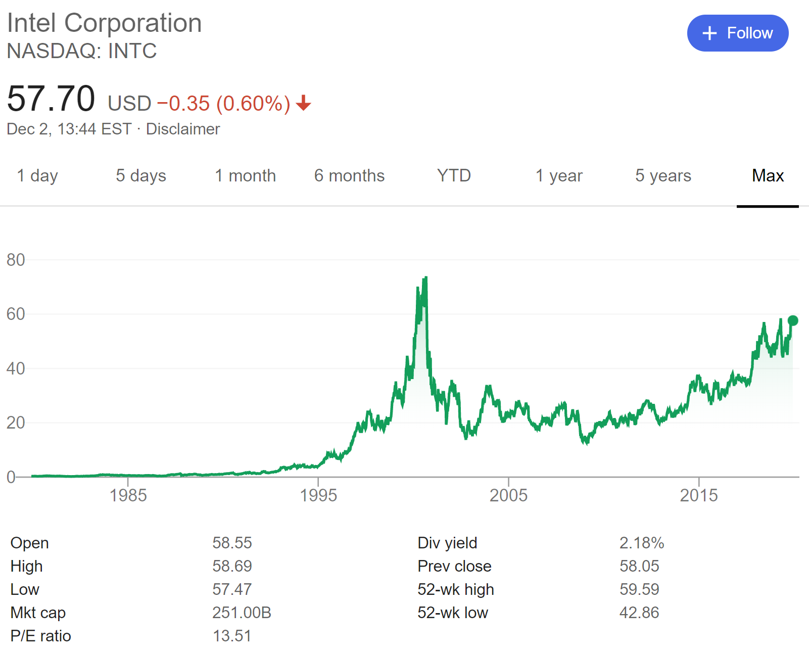
Intel (INTC)
Intel is incredibly consistent, despite competition from AMD and recently Apple:
The company took the same one-time tax hit in 2017Q4, but otherwise EPS shows a slow but steady increase:
The P/X ratios seem pretty reasonable for a tech company:
Other interesting companies
- Amazon - very high P/X ratios
- Microsoft
- Facebook - I worked here
- NVIDIA - exploded recently thanks to GPU usage in Deep Learning
- Fedex - a logistics/delivery company like Fetchr
- Moody’s - one of Warren Buffett’s investments, also detailed in the book, they are essentially a services company (ratings), so they barely have any real assets, resulting in “weird” fundamental analysis charts
- The Coca-Cola Company - one of Warren Buffett’s oldest investments, also detailed in the book
- Allergan - my father worked here for 10 years
- Eastman Kodak - went bankrupt thanks to mobile cameras, then came back