Effective Data Visualization Part 1: Categorical data
Marton Trencseni - Sat 22 August 2020 - Data
Introduction
The goal of building charts and dashboards is to convey information about the underlying data effectively. The user should be able to look at the chart and "get it" quickly. The data professional who builds the start needs to know know "it" is, or at least how the user can get at it.
Unfortunately, many data professionals consider building charts and dashboard to be low-level activities that's "just BI", and they can't be bothered with such considerations. This is a fallacy. Making clear, readable charts is part of the craftmanship minimum for any data related role, whether it's a Data Engineer, Product Analyst, BI Analyst, Data Scientist or ML Engineer. Doing a poor job presenting data in the form of charts and dashboards can mislead the audience, turn off the audience and block the impact of the underlying work.
Pie charts
What's the problem with this chart?
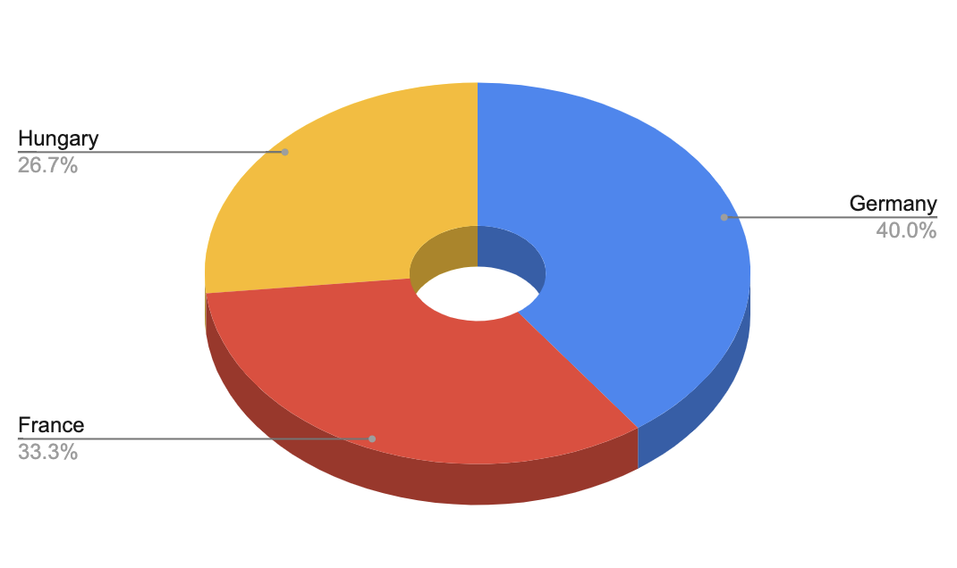
3D doesn't add anything. Let's make it 2D:

The hole in the middle doesn't help. Let's remove it:
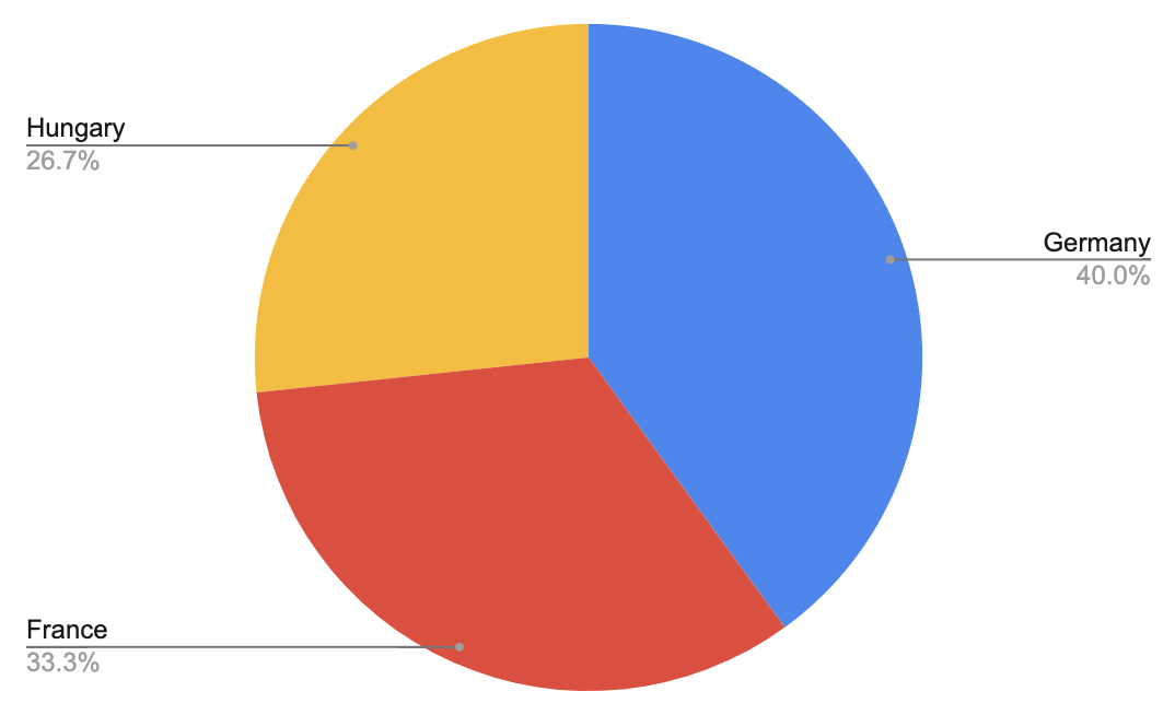
Okay, now the pie chart is pretty minimal, but it's still not good. The problem is, the human brain is not good at reading off proportions from a circular scale. It's really hard to tell how the orange and red areas compare. You actually have to move your eye to the text and read it off. But if you're reading it off the text anyway, what's the point of the pie chart? Let's try a bar chart.
Bar charts

This is better. But what happened with the percentages? The bar chart shows the original metric values now. Let's add some axis labels and a chart title to make it more clear what we're looking at:

This is better. But now we're forced to do eye gymnastics and track the height of the bars to the axis to try to read off values, and we'll be reading off estimated values. Let's fix that:

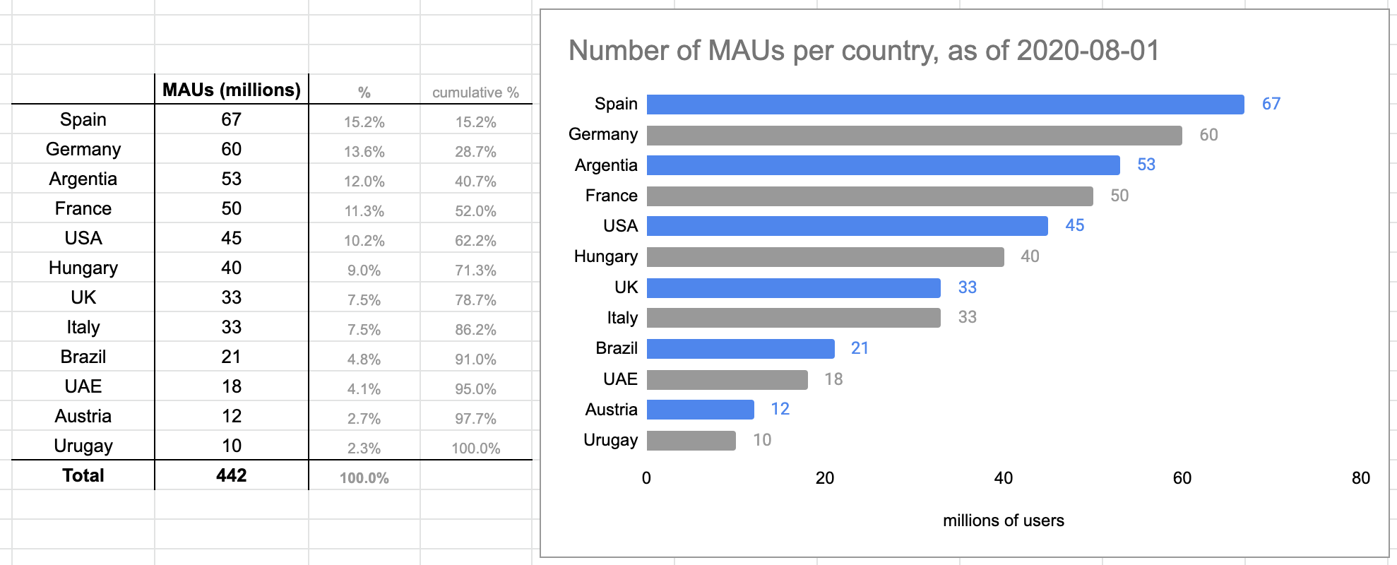
Okay, but it's still confusing. When was this the number of users? In 2019 June or in 2020 February? Let's add that to the title. Format dates per the ISO-8601 standard, like YYYY-MM-DD.

Not bad. But what if there are more countries? A horizontal bar chart will quickly run out of room on the x-axis and the charting software will start tilting the labels:

Let's try a horizontal bar chart:

The major gridlines don't add any value here, let's remove those:

This is somewhat better. But with many values displayed, you have to be careful when moving your eye from left to right, to read off the right value, and not confuse numbers above/below. Let's use colors to guide the eye:

This is not terrible. What we've lost compared to the pie chart is that we can't read off percentages.
At the end of the day, for such a chart, we should either use a horizontal bar chart with a table attached, or just the table.
Tables

Let's improve the table, by:
- using borders to structure the table
- using bold text to highlight columns and totals
- centering text so it's easier on the eyes
- showing secondary information, such as percentages, in gray and smaller text
- adding cumulative percentages, so we can see that the top 4 countries contribute half the users
- changing the column header to make it clear that user counts are in millions

Putting it together:

Great! But are we talking about registered users, monthly active users (MAUs) or daily active users (DAUs). Let's assume we are talking about MAUs, and we can safely assume our audience understands the acronym:
Conclusion
Making clear, readable charts is part of the craftmanship minimum for any data related role. It doesn't matter whether it's in Google Charts (what I used here), Excel, or a dashboarding software like Tableau or Superset. Pie charts are overused and should never be used. A combination of bar charts, tables (and linecharts, not covered in this article) are always preferable.