Effective Data Visualization Part 3: Line charts and stacked area charts

Marton Trencseni - Tue 01 September 2020 • Tagged with charts, dashboards, data, visualization

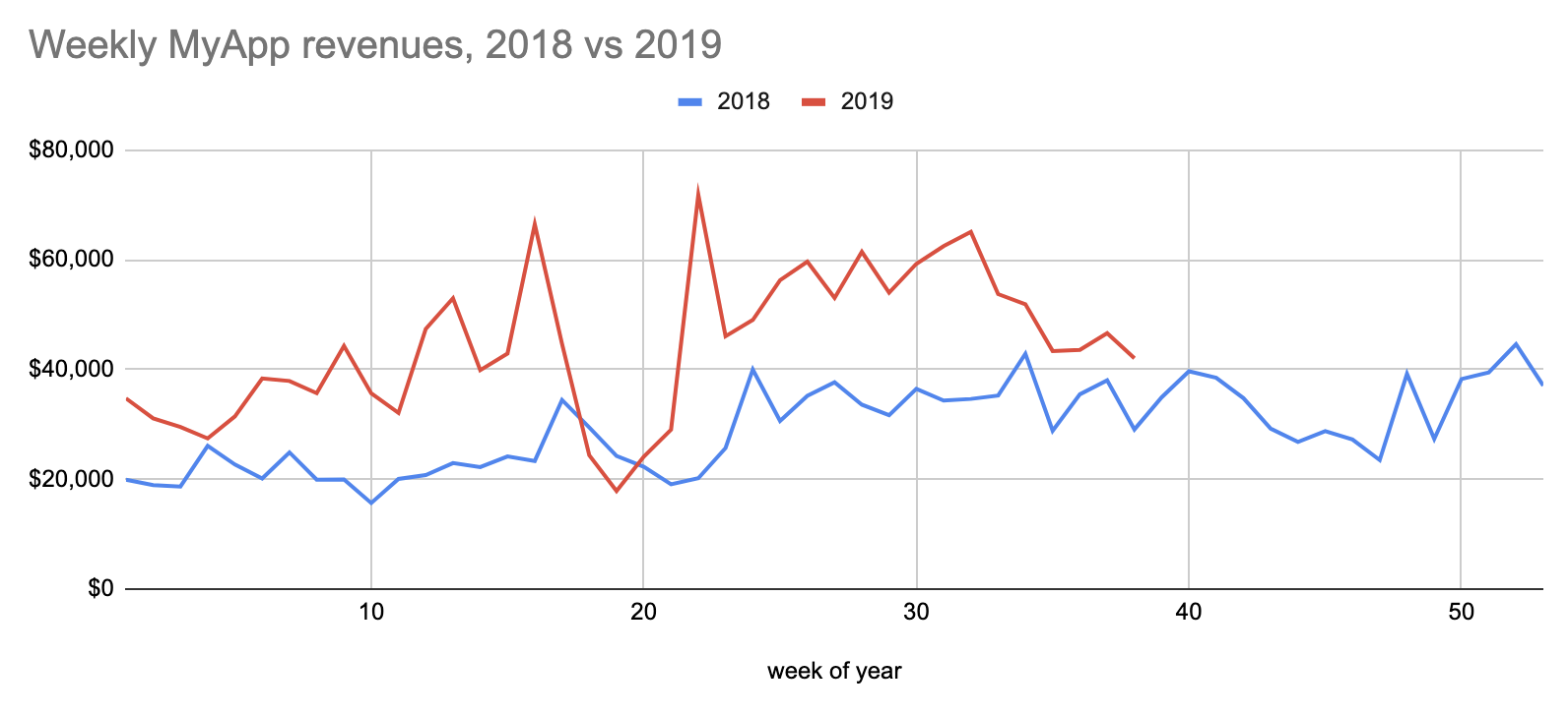
Most charts should be line charts or stacked area chart, because they communicate valuable trend information and are easy to parse for the human eyes and brain.

Continue reading

Effective Data Visualization Part 2: Formatting numbers

Marton Trencseni - Sun 23 August 2020 • Tagged with charts, dashboards, data, visualization

Format numbers for human consumption. What is more readable, 1.539e+5 or 153,859? Showing numbers effectively on spreadsheets, charts, dashboards, reports is a basic ingredient for readability, like formatting code in programming.

Continue reading

Effective Data Visualization Part 1: Categorical data

Marton Trencseni - Sat 22 August 2020 • Tagged with charts, dashboards, data, visualization

Making clear, readable charts is part of the craftmanship minimum for any data related role. In part one, I look at how to present categorical data.

A pie chart

Continue reading