Beat the averages
Marton Trencseni - Sat 07 July 2018 - Data
Introduction
The numbers in this article are made up, but the lessons come from real life.
When doing Data Science, we almost always report averages. This is natural, because it stands for a simple model that everybody can understand. For example, in the delivery business, a topline metric is Deliveries per Driver (DPD), the average deliveries made per driver per day. This is a simple model the CEO can also remember: if our fleet is performing at DPD = 40, and we have 1,000 drivers, we make 40,000 deliveries per day. Being able to multiply two topline numbers and get a third one is a good thing.
When working with averages, we have to be careful though: there are pitfalls lurking to pollute our statistics and results reported. It is important to note that there is nothing wrong with averages themselves, we just have to be careful with them. I don’t believe that for most reporting purposes averages should or can be replaced (eg. by reporting the median), it is simply the job of the Data Science team to make sure the metrics make sense.
Outliers
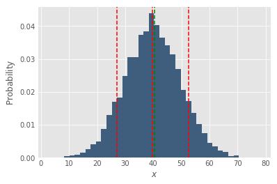
When we say that our DPD is 40 and we have 1,000 drivers, the natural inclination (even for data people) is to imagine 1,000 equivalent drivers, each performing exactly 40 deliveries every day. But we know that the world isn’t this simple. Things like driver performance tend to follow some more interesting distribution. The simplest thing we can imagine is that it follows a normal distribution. The plot below shows a normal distribution, the mean (green) and median (red) coincide. Gauss is happy.

But almost always there are outliers. In the case of drivers, there are various special circumstances which can cause a driver to have very low or very high DPD. For example, maybe the driver got sick, interrupted his route and went home early. Below is a the same distribution as above, with some stragglers introduced. We can see that this shifts the mean (green) down.
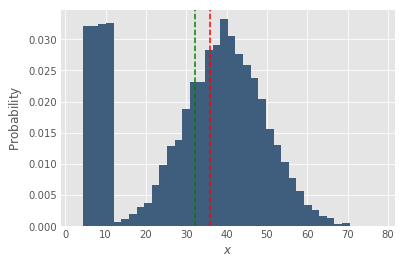
The shift in the mean is important, because it signals that something is going on: a bunch of our drivers got sick and went home early. Maybe tomorrow they are not coming to work. So monitoring both the average and median is important to detect and understand deviations.
Apart from the median, which is also called the 50th percentile, checking out the bottom and top percentiles is also very helpful. Below is the same two plots, with p10 and p90 also showing in red.
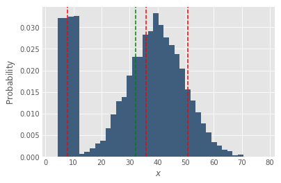
Something really useful happened! After we introduced the stragglers, the p10 dropped from about 27 to about 8!
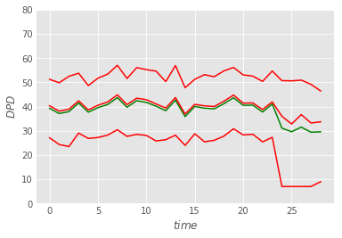
In general, showing percentiles is a useful technique, because as the example above shows, they can dramatically speed up detection of anomalies. In real life work, looking at distribution doesn’t happen on a daily basis, but a timeseries showing the historic DPD can also show p10, median and p90, and can show such anomalies. The chart below shows such a made-up example, showing p10, p50 and p90 in red, the average in green, for the last 30 days for the fleet. On the 25th day a flu started spreading between our drivers, introducing the stragglers as shown in the distribution above. The mean and the median separate somewhat, but the p10 gives it away. It’s worth showing all four lines, at least on internal, debug dashboards.
It’s worth noting the outliers can come from another source too: data bugs. Another good trick is to periodically examine low and high performers in a table, attached to the bottom of the internal report/dashboard.
Finally, outlier/anomaly detection can also be automated, for example Facebook does this internally for various metrics. It’s important to automate at least the visualization of anomalies/distributions/stragglers in a debug dasboard, because in the long-run Data Scientists will forget to check manually (export and plot in ipython takes time).
Several populations
Another reason averages can be polluted is because of multiple populations (outliers can also be thought of as a population). In the delivery business, it is not uncommon to have many separate fleets of drivers, for different purposes. For example, we may have a B2C and a C2C fleet. Another distinction is cars vs bikes. Uber could have a fleet for passengers and a totally separate fleet for UberEats. Below is a (made-up) distribution that’s actually two fleets, a C2C fleet performing at DPD=20 and a B2C fleet performing at DPD=40.
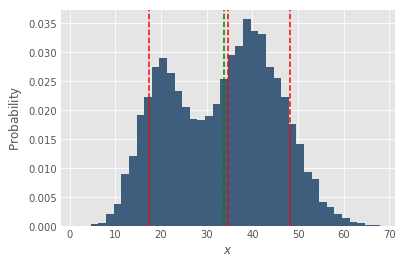
In cases like this, reporting on the blended mean may be misleading. For example, if country X has a B2C and a C2C fleet, while country Y only has a B2C fleet, then reporting just on country-wise DPD will be misleading. For country X the C2C fleet will pull the DPD down, but this doesn’t mean that the Ops team in country X is performing worse, in fact it’s possible their B2C fleet is outperforming country Y’s. Report the per-fleet mean instead.
Skewed distributions
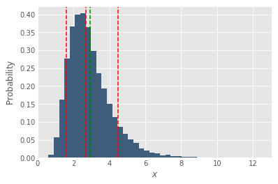
Sometimes distributions are not symmetric, they can be lopsided. In this case the median, mode (the most frequent outcome, the maximum of the distribution) and mean can be at different locations, which is often unintuitive for people. This isn’t a problem wrt the mean, but it’s good to know. The Log-normal distribution is one such example:
Percentage instead of mean
Sometimes, when building a metric, the mean is not a good choice. Let’s take pageload times an an example. Suppose we measure the average pageload time in miliseconds, and we see that it is 4,200ms; too high. After rolling out changes, it goes down to 3,700ms; but, 3,700 is still too high. Does that mean the rollout wasn't successful?
In situations like this, it makes sense to bake the goal into the metric. Suppose our goal is 2,000ms, which we deem pleasant from a UX perspective. Then a better way to define the metric is "% of pageloads that are within 2,000ms". If it was 57% before, and 62% after the rollout, it’s more natural to understand what happened: an additional 5% of people now have a pleasant experience when loading our page. If there are 1,000,000 users per month, we impacted 50,000 users per month with the rollout. Not bad! A metric like this is also more motivating for product teams to work on.
Another big advantage of using percentages is increased resiliency to outliers. While the mean could be polluted by outliers (users on slow connections, bots, data bugs), in the % it will be “just” a constant additive factor.
Ratios instead of means
Our delivery business also has C2C, ie. people can call a driver and send a package to another person, on demand. For example, if my partner is at the airport, but they forgot their passport at home, I can use the C2C app to fetch a car and send her the passport in an envelope. As such, the C2C app has standard metrics such as Daily Active Users (DAU) and Monthly Active Users (MAU). These are topline metrics, but we also need a metric which expresses how often people use the product. One way to do it using means would be to count, for each user, how many days they were DAU of the last 28 days. Suppose we call this Average DAU, and it’s 5.2. This is not that hard to understand, but could still be confusing. For example, people always forget the definition of a metric, in this case they would forget if the metric is 28 or 30 or 7 day based. Also, increments like this don’t feel natural: a +1% increment corresponds to +0.28 active days or 6.72 hours.
A better metric is simply to divide DAU per MAU. This is a common metric also used inside Facebook. This feels more natural: if we are honest with ourselves, a user is essentially a MAU, because somebody who hasn’t used the product for 28 days is probably not coming back (For products with more sporadic usage, the base could be a 3*28 days). Thinking like this DAU/MAU is a very natural metric: it is the % of "users" who use the product daily.
Daily variations
Suppose our fleet’s average DPD is 40. Looking at driver X, his DPD yesterday was 29. Is he a low performer? Our first intuition might be to ask what the standard deviation of the fleet is (suppose it is 10), and then argue that this value is not “significantly” off. But from a business perspective, variance is irrelevant: if the COO wants to improve DPD and is looking for low performing drivers to cut, "cutting" at mean minus one sigma is a valid approach.
However, it’s possible that our drivers have significant daily variation in their performance. It’s possible that this driver had a DPD of 29 yesterday, but the previous day it was 47, and their historic average is actually 42. Always compare averages to averages. In this case, compare the fleet’s average DPD over a long enough timeframe (probably at least 28 days) to the driver’s average DPD in the same 28 days. That is a more fair comparison to make, because it smooths daily variation. Of course, remember what was said here, for example don’t count days when the driver was sick, and compare him to his own fleet.
In summary
- Using averages is okay most of the time.
- Reporting on medians is probably not feasible in a business/product setting.
- Instead, make sure the average is meaningful.
- Watch out for outliers.
- Check median/p10/p90 and distributions regularly.
- Prune/separate outliers.
- Split up populations (B2C/C2C, car/bike), etc. to make sure the reported average (or median) is a meaningful number.
- Outliers can be real outliers, or issues in the data (eg. Self Pickup as a driver)
- Sometimes the population is homogeneous, but the distribution is skewed to one side or bimodal, in this case the average may be intuitively misleading.
- Sometimes, using %s instead of averages makes a better metric (Pageloads within 2000ms vs Average Pageload time).
- Sometimes, using a ratio instead of averages makes a better metric (example: DAU/MAU vs average number of DAUs in the last 28 days).
- Be careful when comparing daily snapshots and averages, there may be significant daily variation in performance.