Effective Data Visualization Part 3: Line charts and stacked area charts
Marton Trencseni - Tue 01 September 2020 - Data
Introduction
On most dashboards for product, operations or for business consumption, charts should be line charts or stacked area charts. These chart types communicate valuable trend patterns effectively, and are easy for the human eyes and brain to parse. On many dashboards, a "big number with year-over-year" type widget is used, but line charts work better. For example, in 2020 August, showing the YTD revenue compared to 2019 August conflates the actual year-over-year performance during January and February, and the effect of Covid-19 in March and later. On a line chart, these effects are obvious and visible.
Toy example
Let's walk through an example. Suppose we have an app called MyApp and we want to show revenues up until 2019 Q3. First, let's try a daily line chart:
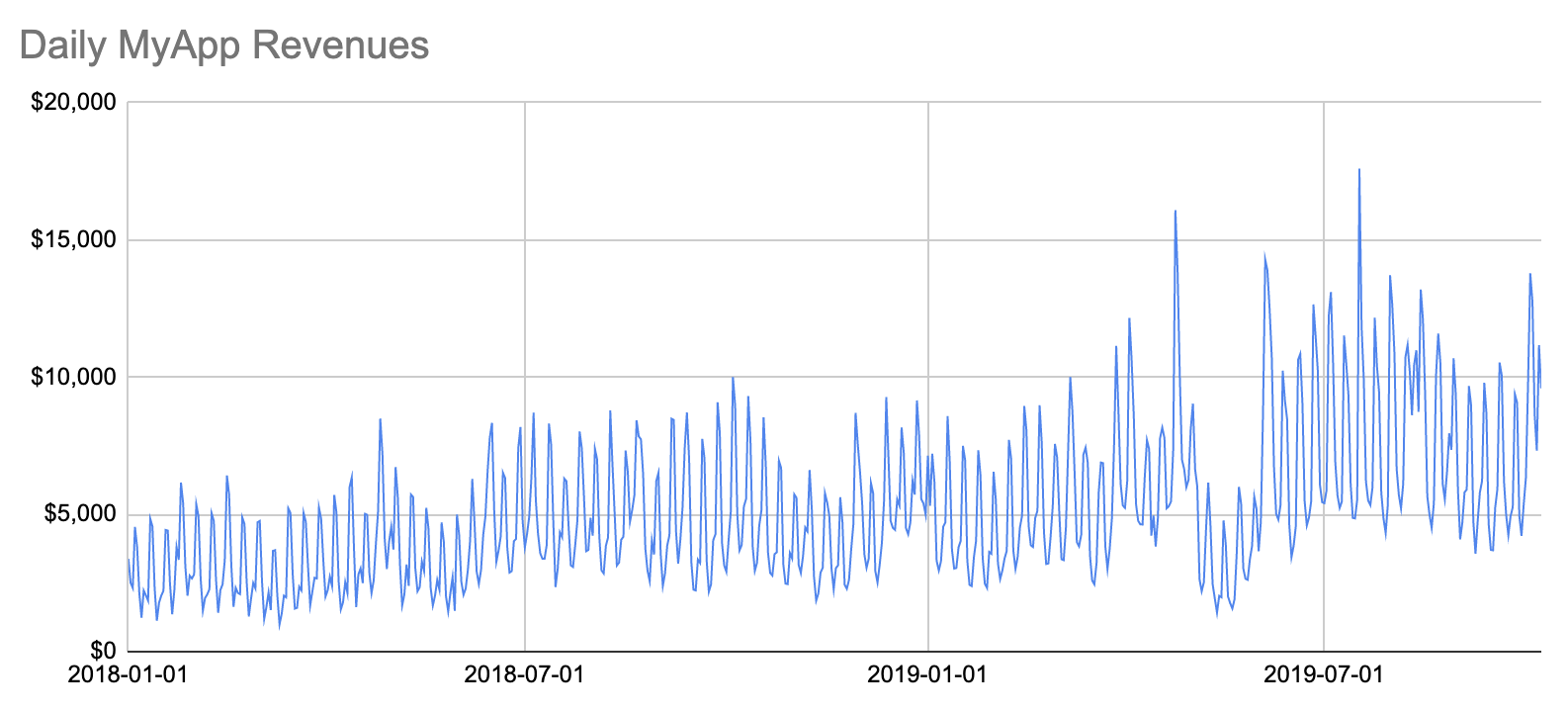
There is too much information here. Seeing the weekly periodicity 52 times per year pollutes this chart. Let's turn it into a weekly chart:
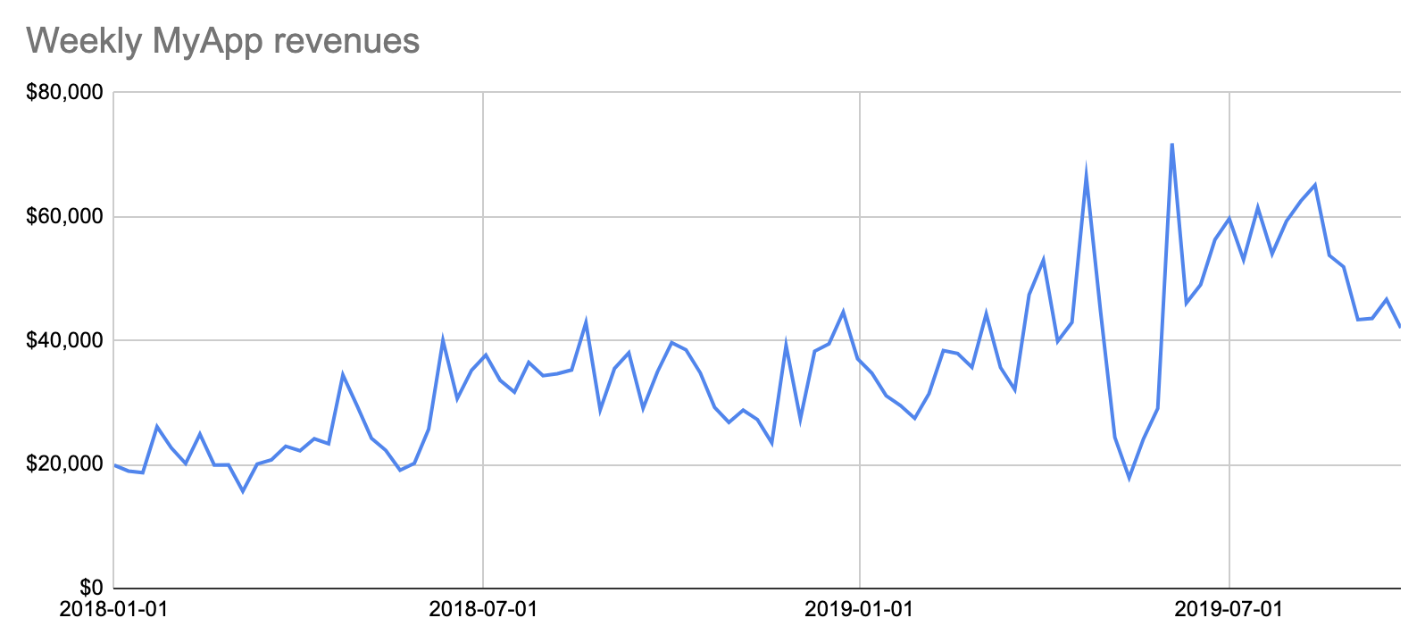
If we want to show the weekly periodicity of a metric, we can make a separate, supporting chart for that, and show median values for daily metrics. I will skip that step here.
The weekly chart is better, but it's not totally clear whether 2019 is better than 2018. It does't jump off the screen. A sub-optimal solution is to compute the explicit year-over-year percentage, and show that as a % on a linechart. But we can do better, with a simple trick. Instead of showing the date on the x-axis, we can show the day-of-year, and show 2018 and 2019 as two lines:
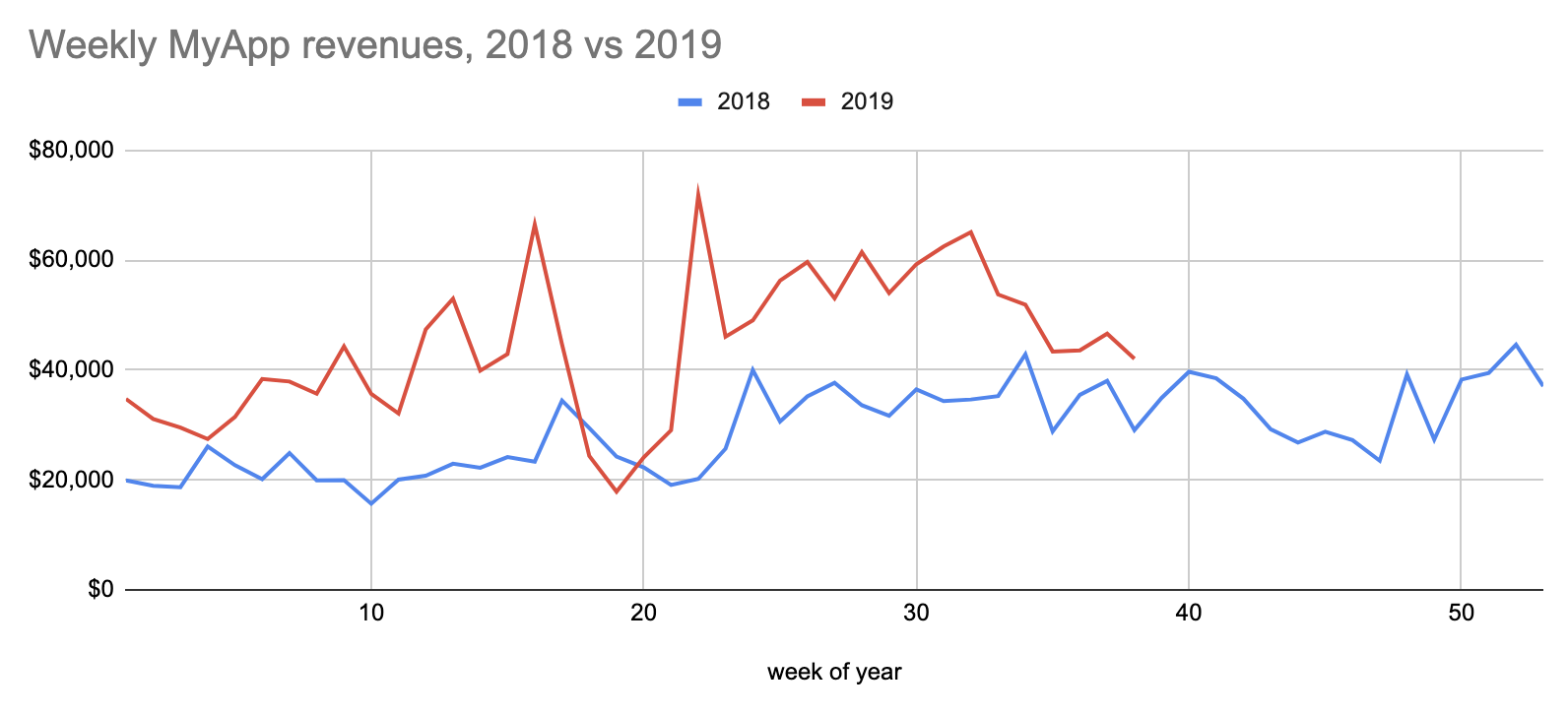
This is a pretty neat trick that I never figured out myself, I learned this at Facebook. This makes it obvious that 2019 is indeed doing better than 2018, and also shows that there was a slump period in 2019 that's worth investigating.
From this chart it's not obvious whether 2019 is ahead of 2018 YTD (year-to-date), given that there was as slump. Let's make it visually obvious:
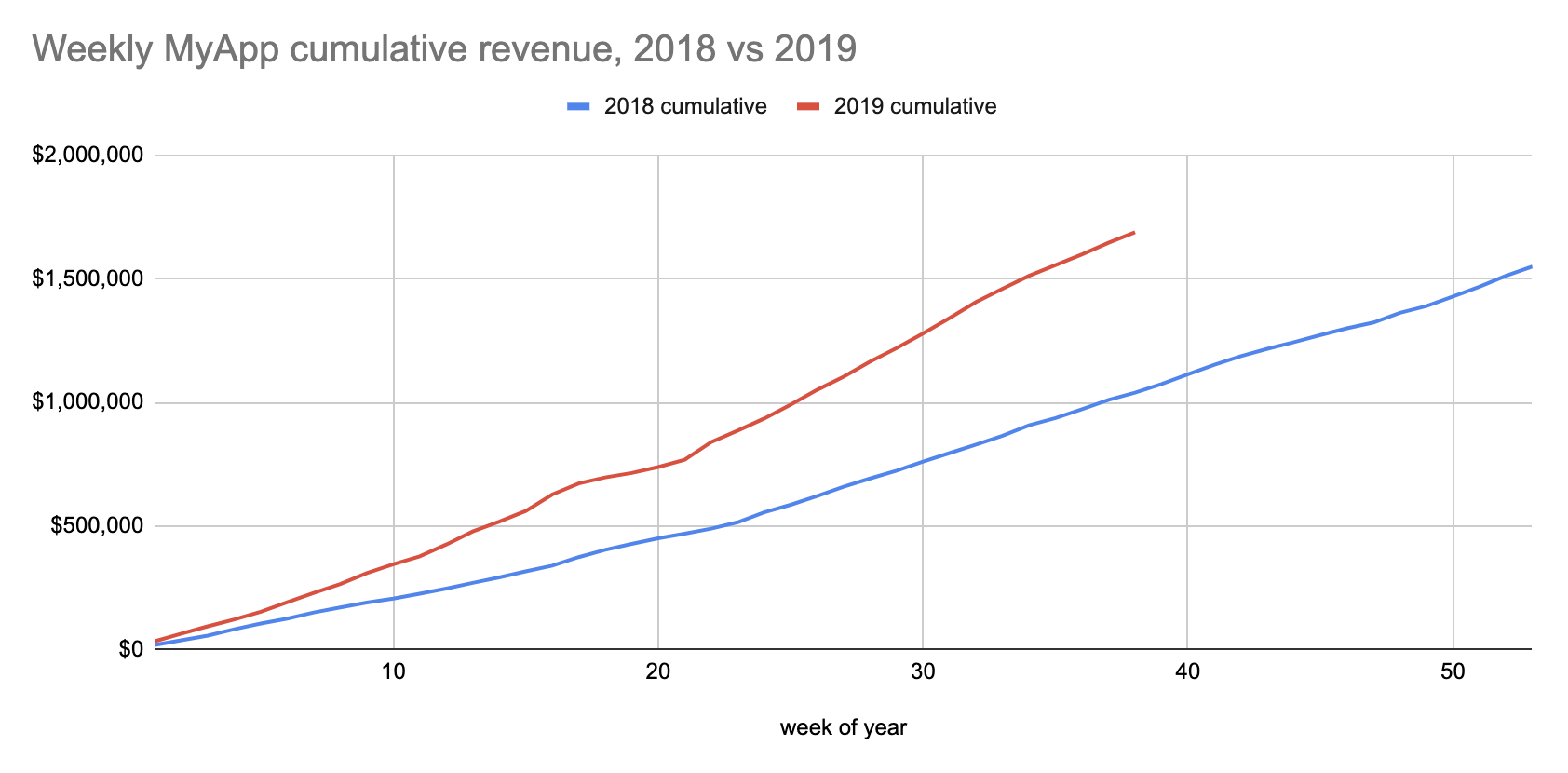
This nicely shows that although there was slump (the 2019 cumulative line flattens for a bit), 2019 is doing much better than 2018. On a dashboard, actual numbers can be read off by hovering with the mouse over the chart.
Finally, let's say we want to split our revenue by country, and we're only in 2 countries, USA and Canada. In this case, since we're now segmenting by country, we can't segment by year, so we have to go back to showing the date on the x-axis:
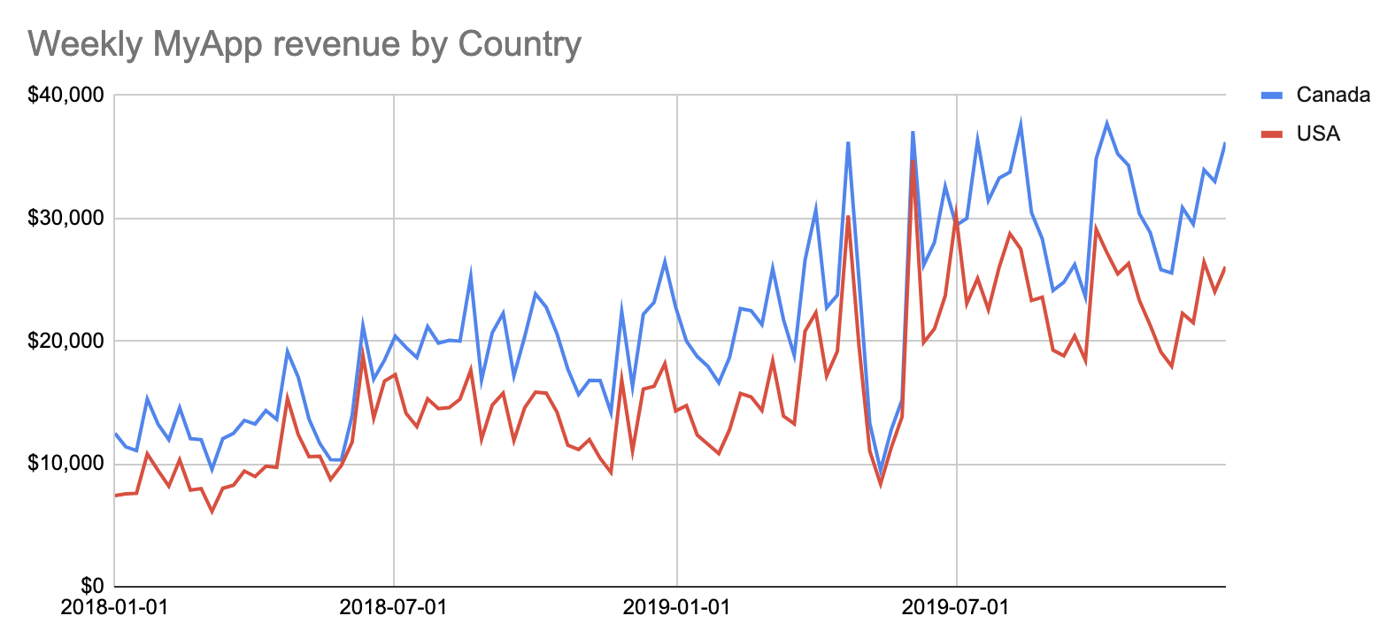
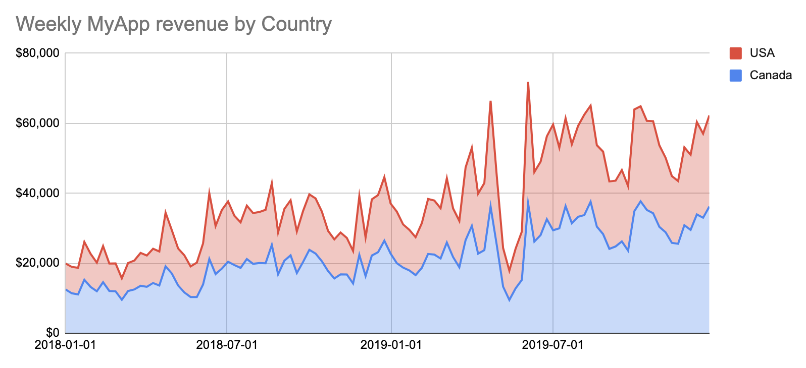
Note that the y-axis is USD, we converted our CAD revenues to USDs. When showing money on a chart, you must always convert to the same currency. The big improvement here is to show this as a stacked area chart, because our countrywise revenues are additive:
Discussion
Most charts should be line charts or stacked area charts, because they communicate valuable trend information and are easy to parse for the human eyes and brain. When building these charts, consider these points:
- The x-axis should usually be a date (or day-of-year), formatted like
YYYY-MM-DDper the ISO-8601 standard. - The y-axis should be a well-defined metric, like
Revenue (USD)orMonthly Active Users (28d).- Put the metric on the y-axis label, unless the metric is mentioned in the chart title, then you don't need to.
- If the metric needs to be explained, put a textbox on the dashboard and explain it.
- Remove unnecessary visual clutter (like 3D, gradients, etc) from the chart: a chart is perfect if you can no longer remove clutter from it but it still communicates all the information it needs to.
- Pick good colors for different lines, like red and blue. Don't pick different shades of the same color, some of your users may be colorblind.
- Pick a range for your x-axis that makes sense. On some dashboards, the range can be specified, in this case pick a good default that renders a consumable chart, so that the user is not scared away when opening the dashboard.
- Pick a granularity (daily, weekly, monthly, etc) for your x-axis that makes sense. On some dashboards, the granularity can be specified, in this case pick a good default that renders a consumable chart, so that the user is not scared away when opening the dashboard.
- The chart should have a clear and concise title, like
Weekly MyApp revenue by Country. - If showing unsegmented multi-year data, consider breaking it into 1 line per year, to effectively show year-over-year visual information.
- If it makes sense, also show the cumulative metric value on a supporting line chart, eg. revenue, units sold, etc.
- If the metric is additive and segmented, show it on a stacked area chart.
- But only do so if the total is the actual total. For example, if you're only showing USA and Canada on a chart, but the app is actually also out in Mexico (but we don't yet have data on it), showing a "total" on a stacked area chart is misleading, because it's not the actual total. In such a partial case, it's better to use line charts and put a note in a textbox.
- If your data has outliers, in a product/business setting, consider leaving that data off (eg. by excluding it with a
HAVINGclause in theSQL).- Never use a logarithmic y-axis, it's visually misleading, and some of your users will be confused.