The reward for long-term resilience in simple trading strategies - Part II
Marton Trencseni - Sun 16 March 2025 - Finance
Introduction
In the previous article, I explored how longer-term, more resilient approaches to trading can yield superior returns using simple, rule-based strategies. Building on that discussion of position length, take-profit, and stop-loss dynamics, I compared strategies ranging from daily trades to year-long holds across Nasdaq-100 stocks. By looking at metrics like win ratio, mean return, and Sharpe ratio, I showed that strategic patience and a willingness to accept temporary losses can lead to more consistent, risk-adjusted performance.
In this follow-up, I take a closer look at the raw metrics for these strategies without comparing them to a baseline. I also examine how these strategies have fared year by year over a 10-year period. For this analysis:
- The statistics are displayed as-is, without comparing to a baseline strategy.
- The stock universe is defined as:
tickers = ['TSLA', 'META', 'MSFT', 'GOOG', 'INTC', 'NVDA', 'AMD', 'AAPL', 'AMZN', 'NFLX']
- Daily closing prices for the 10-year period ending in 2024.
- Returns are always annualized (using annual_return = daily_return**annual_trading_days).
- Position lengths of up to 3 years are considered.
- Annual performance lines are shown to highlight the seasonal variation in both bear and bull markets.
The code is up on Github.
Data and code
Downloading data, as before, is straighforward with yfinance:
tickers = ['TSLA', 'META', 'MSFT', 'GOOG', 'INTC', 'NVDA', 'AMD', 'AAPL', 'AMZN', 'NFLX']
# download 10 years worth of daily closing prices for all 10 stocks
df_nasdaq_10 = yf.download(tickers, '2015-01-01', '2024-12-31')
df_nasdaq_10.head()
The rest of the code follows the same basic structure as in the previous article, with a few changes to the plotting code so that all three statistics (win ratio, mean annualized return, and Sharpe ratio) are shown side by side.
Overall performance for different position lengths
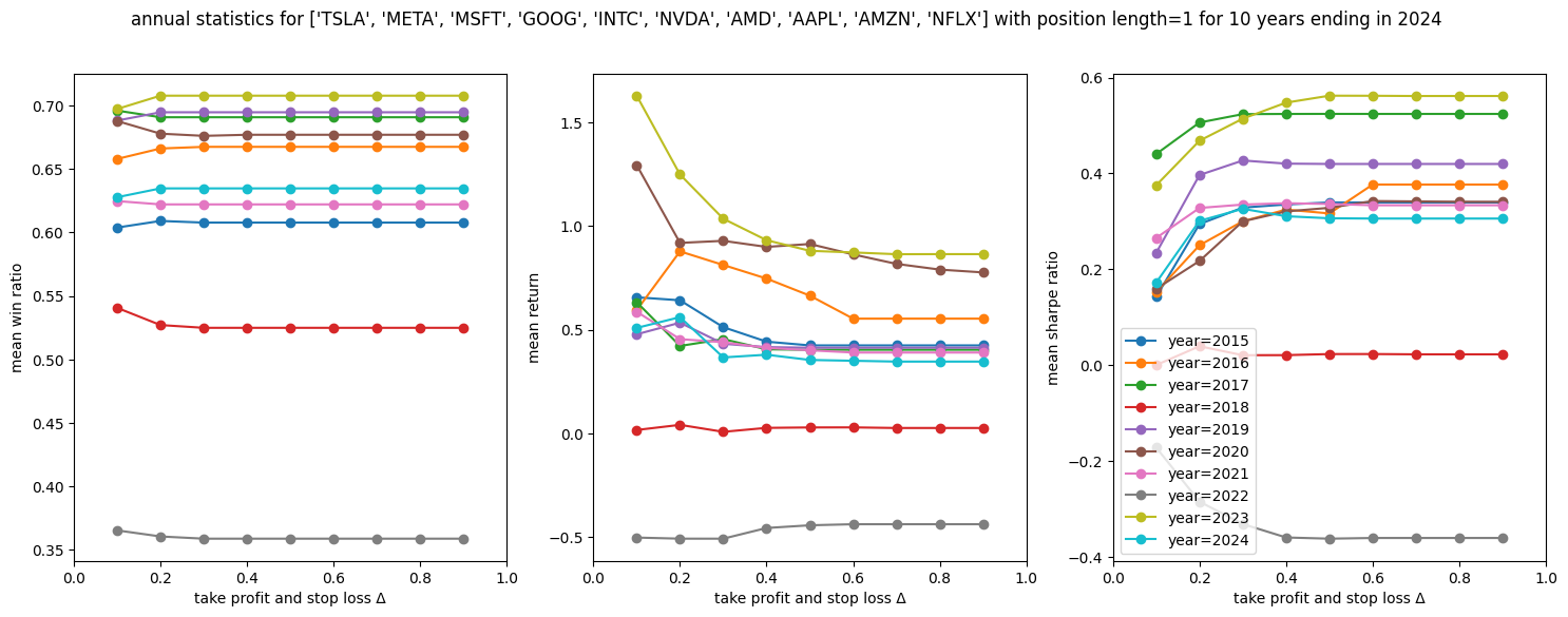
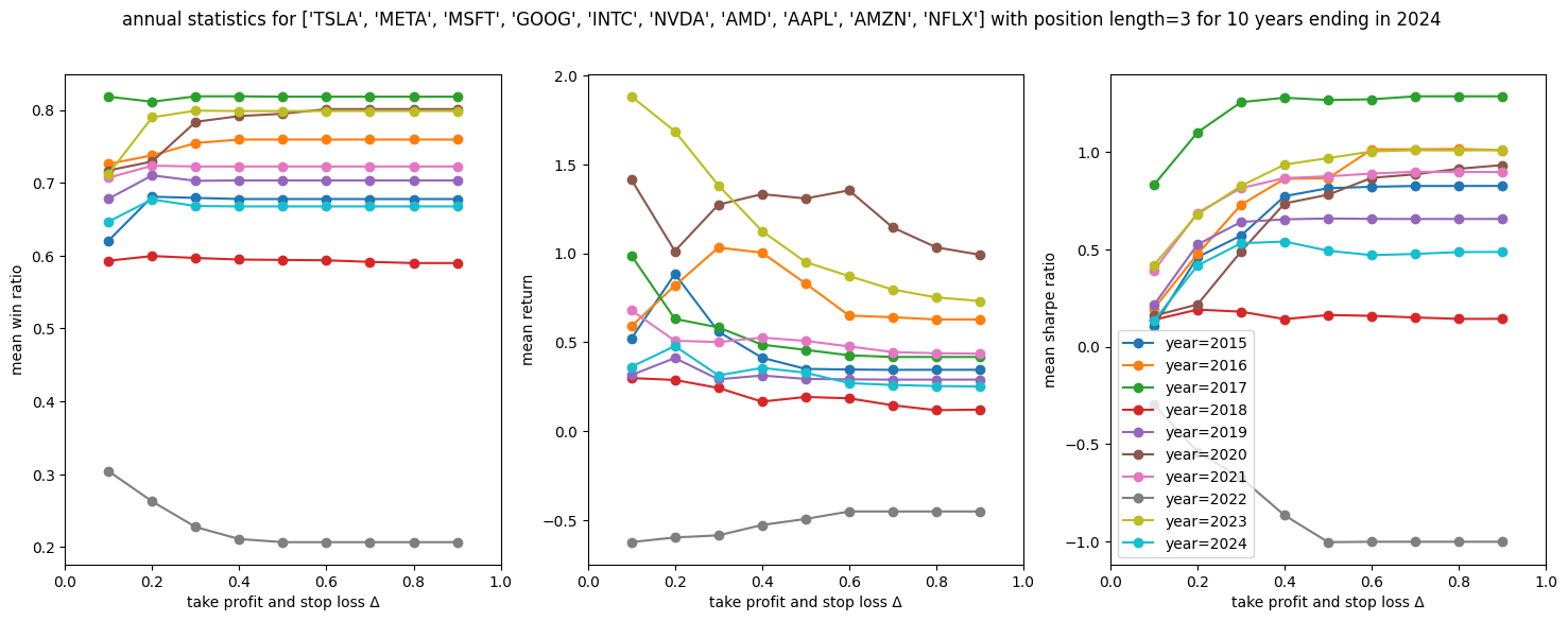
First, let's see how the 10 stocks perform on average as a function of take-profit and stop-loss delta Δ (x-axis) for different position lengths:
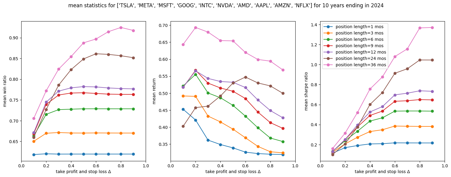
The plots suggest that, for these 10 stocks over the 10-year period:
- Holding positions longer was better across all three metrics.
- In terms of win ratio and Sharpe ratio, higher take-profit and stop-loss Δ values were better.
- However, for returns, which is what ultimately matters (?), higher take-profit and stop-loss Δ values were generally worse.
This last point seems counterintuitive. How is it that win ratio and Sharpe ratio go up with larger Δ, yet the mean time-normalized (annualized) return goes down? I will return to this in the conclusion.
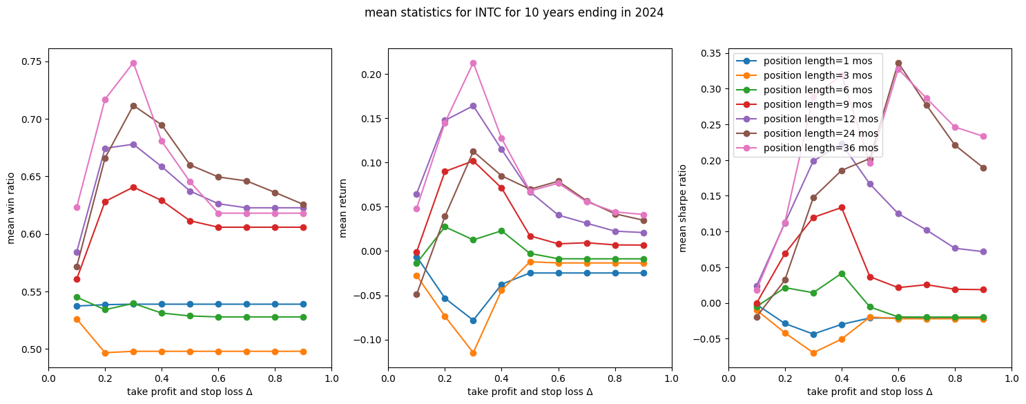
Now, let's look at the same plots for individual stocks, which show a lot of variation compared to the average. First, Intel:
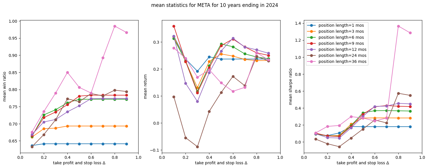
Next, Facebook:
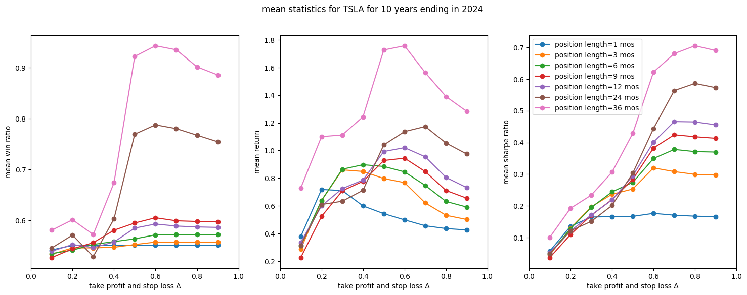
Finally, Tesla:
Annual variation in performance
Next, instead of having separate lines for different position lengths over the full 10 years, I focus on a single position length and show annual performance lines. This helps to see seasonal effects and market cycles.
First, with a maximum position length of 1 month:
Then, for a 3-month position length:
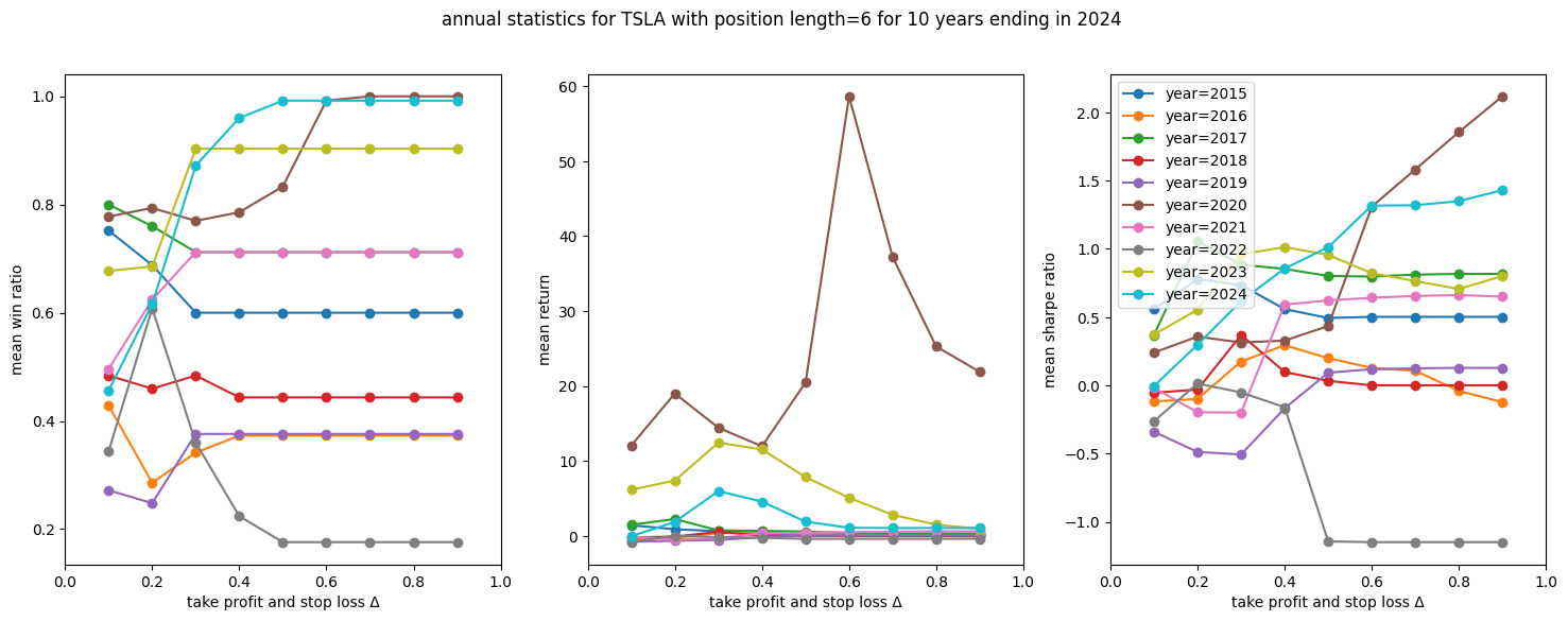
And for a 6-month position length:
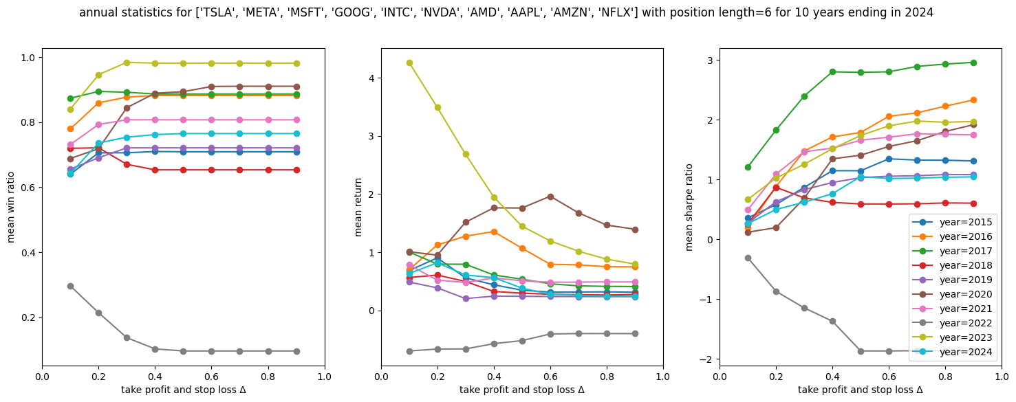
The charts clearly show that 2022 was a bear market, with negative win rates. In 2018, the win rate was also lower, but even with a 3-month position length, win ratios of around 60% were possible for these stocks. For the other years, performance varies, yet the shape of the lines remains surprisingly consistent.
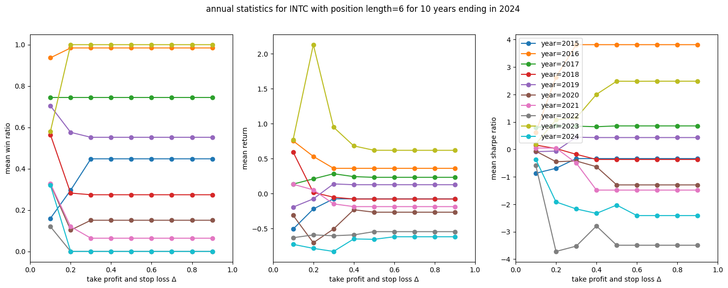
Now, let's look at some specific securities at a 6-month maximum position length. First, Intel:
Next, Facebook:
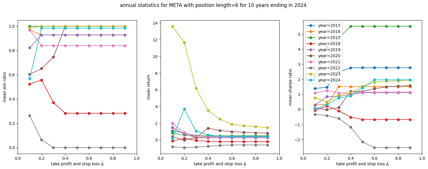
Finally, Tesla:
Conclusion
So, how is it that win ratio and Sharpe ratio increase with larger take-profit and stop-loss Δ, while the mean time-normalized (annualized) return goes down? To answer this, I plotted the raw unnormalized mean return together with the mean active days (the time spent in the position).
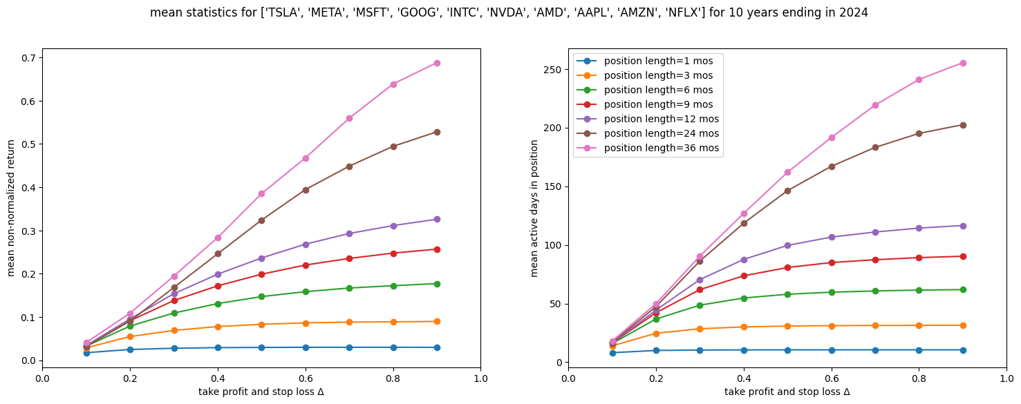
The explanation becomes clear. Both the unnormalized mean return and the mean active days increase linearly with take-profit and stop-loss Δ. It is the normalization process that creates the downward trend in the annualized return. Imagine having a 2x return in 1 day, 4x return in 2 days, and 8x return in 3 days. In all these cases, the normalized daily return is the same (2x). However, if the return increases less steeply — linearly — say 2x in 1 day, 3x in 2 days, and 4x in 3 days—the normalized daily return would drop over time (2x, 1.73x, 1.58x).
This leads to two key questions for the investor:
- How important is the win ratio? In my view, win ratio is as important due to psychological factors — as the returns because a higher win ratio can keep an investor motivated and engaged.
- When using normalized returns, we assume that when a position exits, there is another attractive opportunity. If that isn’t the case, an investor might prefer a strategy with lower normalized returns but higher actual returns.
In future posts, I will explore these nuances further.